Let’s See a Little More Effort

I often like to browse the aisles of my local Best Buy to see the various DVD cover designs. Modern movies are constantly breaking barriers in creativity, technology, and visual appeal. That same dedication and innovation is rarely translated into the artwork for DVD releases. The genre that obviously doesn’t give much thought to “aisle appeal” is Romantic Comedy. I’ve noticed an alarming pattern in romantic comedy DVD cover art: photos of the actors divided by a white “title bar” or photos of the film with the star standing in front. All these movies look the same and tell the buyer nothing about the potentially amazing storyline or hilarious star performances. It also looks like they simply go to the same designer, who has somehow convinced them this is the best way to represent their films on the shelf. So romantic comedies, bust out of your comfort zone and let’s see some creativity up in here.
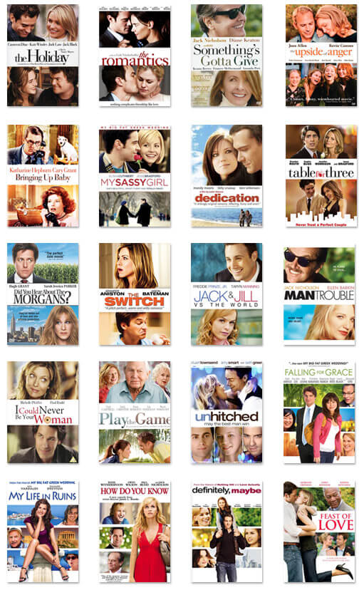
a grid of romantic comedy DVDs that all look the same

Back to the Future

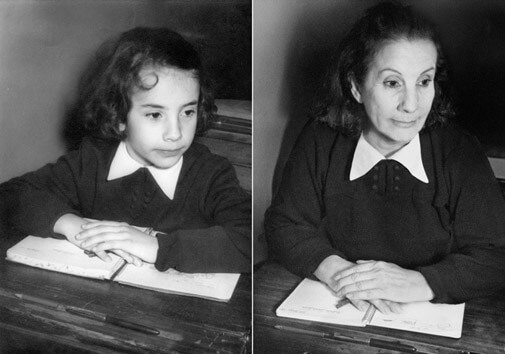
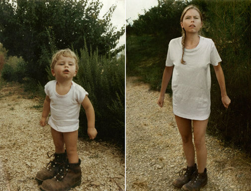
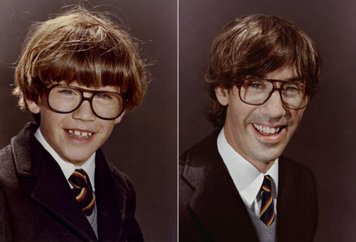
I’ve recently been enjoying Young Me Now, a blog that posts photo recreations. I love how it shows the changes over time and also the creativity of the subjects. Then, I discovered Back to the Future, a photo project by artist Irina Werning. I was blown away. She takes the same concept, but adds a level of detail that is so impressive, I can’t stop looking. She not only recreates the pose, expression, and location, but also the exact clothing, lighting, color balance, and natural fading that occurs with older photos. So in love with these. Check out her site www.irinawerning.com to view the rest.

Oscar Wilde

“Selfishness is not living as one wishes to live, it is asking others to live as one wishes to live.”

My Favorite Places: #1 Phoenix

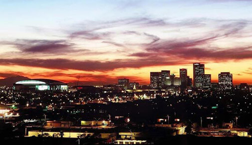
Phoenix skyline

As wonderful and whimsical as they are, my previous 9 favorite places just aren’t the same as my hometown of Phoenix, Arizona. I hear a lot of criticism about our town: bad schools, unlivable weather, nothing to do, ignorant people. I’ve found exactly the opposite to be true. I’m a warm weather kind of gal so the dry heat of Phoenix suits me perfectly. I prefer sunshine to rain and flip flops to... well, any other kind of shoe. I’ve experienced and observed the passion and determination of Phoenix teachers. I’ve had the pleasure of attending inspiring and entertaining local events, dining in unique restaurants, and brushing elbows with amazingly talented and dedicated artists. I’ve had conversations with intellectuals, activists, and compassionate individuals who, even if we disagree on issues, want to leave our city better than when they arrived.

As fun and exciting as traveling can be, I’m always relieved to arrive back at Sky Harbor (the best named airport) and to drive the familiar curves of the 101 toward home. The sunsets are amazing, the swimming pools endless, and the cheesy Western gear is so much fun. I sometimes romanticize living elsewhere, but Phoenix really is my home. And there’s no place like it.

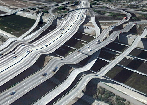
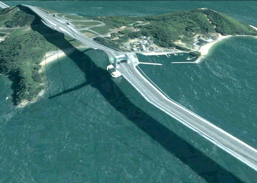
Postcards from Google Maps

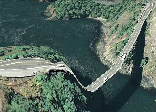
I saw these on Apartment Therapy and was in awe. Artist Clement Valla takes images from Google Maps that, when viewed at the right angle, transform landscapes into warped and surreal representations. Valla says:

The images are screenshots from Google Earth with basic color adjustments and cropping. I am collecting these new typologies as a means of conservation--as Google Earth improves its 3D models, its terrain, and its satellite imagery, these strange, surrealist depictions of our built environment and its relation to the natural landscape will disappear in favor of better illusionistic imagery. However, I think these strange mappings of the 2-dimensional and the 3-dimensional provide us with fabulous forms that are purely the result of algorithmic processes and not of human aesthetic decision making. They are artifacts worth preserving.

View More Amazing Google Map Postcards