Let’s See a Little More Effort
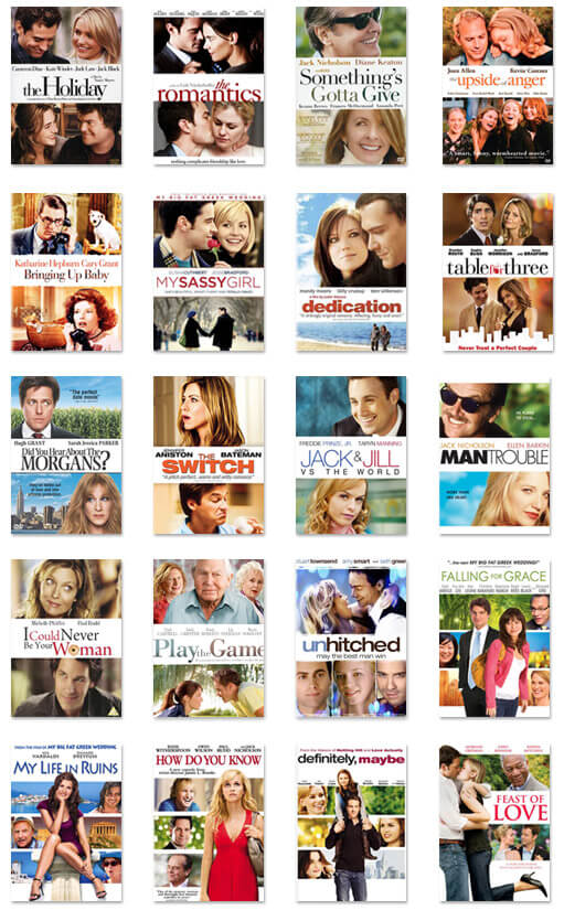
I often like to browse the aisles of my local Best Buy to see the various DVD cover designs. Modern movies are constantly breaking barriers in creativity, technology, and visual appeal. That same dedication and innovation is rarely translated into the artwork for DVD releases. The genre that obviously doesn’t give much thought to “aisle appeal” is Romantic Comedy. I’ve noticed an alarming pattern in romantic comedy DVD cover art: photos of the actors divided by a white “title bar” or photos of the film with the star standing in front. All these movies look the same and tell the buyer nothing about the potentially amazing storyline or hilarious star performances. It also looks like they simply go to the same designer, who has somehow convinced them this is the best way to represent their films on the shelf. So romantic comedies, bust out of your comfort zone and let’s see some creativity up in here.
